multi-column layout (多栏布局)
实现两栏布局,右侧自适应?三栏布局中间自适应呢?
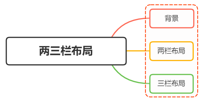
背景
在日常布局中,无论是两栏布局还是三栏布局,都是非常常见的布局方式
两栏布局
两栏布局实现效果就是将页面分割成左右宽度不等的两列,宽度较小的列设置为固定宽度,剩余宽度由另一列自适应填充
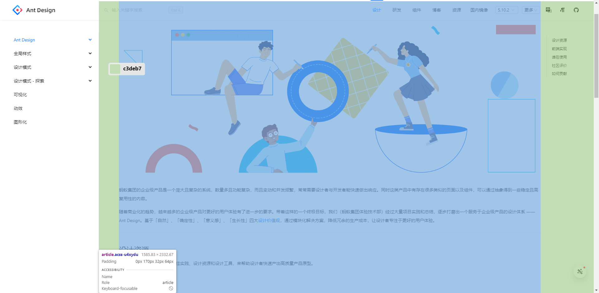
比如 Ant Design 文档,蓝色区域为主要内容布局容器,侧边栏为次要内容布局容器
这里称宽度较小的列父元素为次要布局容器,宽度较大的列父元素为主要布局容器
这种布局适用于内容上具有明显主次关系的网页
三栏布局
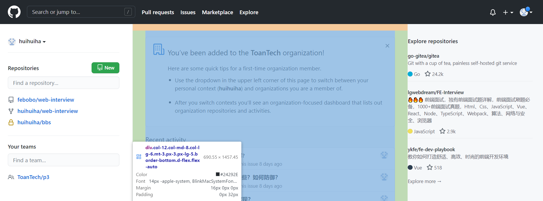
三栏布局按照左中右的顺序进行排列,通常中间列最宽,左右两列次之 大家最常见的就是 Github
Github 更新了布局,现在是两栏布局,右侧为主要内容布局容器,左侧为次要内容布局容器
两栏布局
两栏布局非常常见,往往是以一个定宽的侧边栏为次要内容布局容器,剩余宽度的主要内容布局容器自适应填充
实现思路也非常的简单:
float 浮动
- 使用
float左浮动左边栏 - 右边模块设置
margin-left撑出内容块做内容展示 - 为父级元素设置
BFC,防止下文元素飞到上方内容
代码如下:
html
<style>
  .box {
    overflow: hidden; /* 添加BFC */
  }
  .left {
    float: left;
    width: 200px;
    background-color: gray;
    height: 400px;
  }
  .right {
    height: 400px;
    margin-left: 120px;
    background-color: lightgray;
  }
</style>
<div class="box">
  <div class="left">左边</div>
  <div class="right">右边</div>
</div>
点击查看效果 float 实现两栏布局
左边
右边
还有一种更为简单的使用则是采取: flex 弹性布局
flex 弹性布局
html
<style>
  .box {
    display: flex;
  }
  .left {
    width: 120px;
  }
  .right {
    flex: 1;
  }
</style>
<div class="box">
  <div class="left">左边</div>
  <div class="right">右边</div>
</div>
点击查看效果 flex 实现两栏布局
左边
右边
flex 可以说是最好的方案了,代码少,使用简单
注意的是,flex 容器的一个默认属性值: align-items: stretch
这个属性导致了列等高的效果。如果不需要等高,可以设置为 align-items: flex-start
三栏布局
实现三栏布局,通常是左右两列宽度固定,中间列自适应填充:
- 两边使用
float,中间使用margin撑开 - 两边使用
absolute,中间使用margin - 两边使用
float和负margin display: table实现flex实现grid网格布局
两边使用 float ,中间使用 margin
需要将中间的内容放在 html 结构最后,否则右侧会臣在中间内容的下方
html
<style>
  .wrap {
    height: 400px;
    padding: 10px;
    overflow: hidden; /* 生成BFC,计算高度时考虑浮动的元素 */
  }
  .left {
    width: 120px;
    height: 400px;
    float: left;
    background: gray;
  }
  .right {
    width: 120px;
    height: 400px;
    float: right;
    background: gray;
  }
  .middle {
    margin-left: 130px;
    height: 400px;
    background: lightpink;
    margin-right: 130px;
  }
</style>
<div class="wrap">
  <div class="left">左侧</div>
  <div class="right">右侧</div>
  <div class="middle">中间</div>
</div>
点击查看效果 float 、 margin 实现三栏布局
左侧
右侧
中间
原理如下:
- 两边固定宽度,中间宽度自适应。
- 利用中间元素的 margin 值控制两边的间距
- 宽度小于左右部分宽度之和时,右侧部分会被挤下去
存在的缺点:
- 主体内容是最后加载的,不利于 SEO
- 右边在主体内容之前,如果是响应式设计,不能简单的换行展示
两边使用 absolute ,中间使用 margin
基于绝对定位的三栏布局:注意绝对定位的元素脱离文档流,相对于最近的已经定位的祖先元素进行定位。无需考虑 HTML 中结构的顺序
html
<style>
  .container {
    position: relative;
  }

  .left,
  .right,
  .main {
    height: 400px;
    text-align: center;
  }

  .left {
    position: absolute;
    top: 0;
    left: 0;
    width: 120px;
    background: gray;
  }

  .right {
    position: absolute;
    top: 0;
    right: 0;
    width: 120px;
    background: gray;
  }

  .main {
    margin: 0 130px;
    background: lightpink;
    color: white;
  }
</style>

<div class="container">
  <div class="left">左边固定宽度</div>
  <div class="right">右边固定宽度</div>
  <div class="main">中间自适应</div>
</div>
点击查看效果 absolute 、 margin 实现三栏布局
左侧
右侧
中间
实现流程:
- 左右两边使用绝对定位,固定在两侧
- 中间占满一行,使用
margin和左右两边留出 10px 的间隔
两边使用 float 和负 margin
html
<style>
  .left,
  .right,
  .main {
    height: 400px;
    text-align: center;
  }

  .main-wrapper {
    float: left;
    width: 100%;
  }

  .main {
    margin: 0 130px;
    background: black;
    color: white;
  }

  .left,
  .right {
    float: left;
    width: 120px;
    margin-left: -100%;
    background: gray;
  }

  .right {
    margin-left: -120px; /* 同自身宽度 */
  }
</style>

<div class="main-wrapper">
  <div class="main">中间自适应</div>
</div>
<div class="left">左边固定宽度</div>
<div class="right">右边固定宽度</div>
点击查看效果 float 和负 margin 实现三栏布局
中间自适应
左边固定宽度
右边固定宽度
实现过程:
- 中间使用了双层标签,外层是浮动的,以便左中右能在同一行展示
- 左边通过使用负
margin-left: -100%,相当于中间中间的宽度,所以向上偏移到左侧 - 右边通过使用负
margin-left: -100px,相当于自身宽度,所以向上偏移到最右侧
缺点:
- 增加了
.main-wrapper一层,结构变复杂 - 使用负
margin,调试也相对麻烦
使用 display: table 实现
<table> 标签用来展示行列数据,不适合用于布局 但是可以使用 display: table 来实现布局的效果
html
<style>
  .container {
    width: 100%;
    height: 400px;
    text-align: center;
    display: table;
    table-layout: fixed;
  }

  .left,
  .right,
  .main {
    display: table-cell;
  }

  .left,
  .right {
    width: 120px;
    background: gray;
  }

  .main {
    background: lightpink;
    color: white;
    width: 100%;
  }
</style>

<div class="container">
  <div class="left">左边固定宽度</div>
  <div class="main">中间自适应</div>
  <div class="right">右边固定宽度</div>
</div>
点击查看效果 display: table 实现三栏布局
左边固定宽度
中间自适应
右边固定宽度
实现原理:
- 通过
display: table设置为表格,设置table-layout: fixed表示列宽自身宽度决定,而不是自动计算 - 内层的左中右通过
display: table-cell设置为表格单元 - 左右设置固定宽度,中间设置
width: 100%填充剩下的宽度
使用 flex 实现
利用 flex 弹性布局,可以简单实现中间自适应
html
<style>
  .wrap {
    display: flex;
    justify-content: space-between;
  }

  .left,
  .right,
  .middle {
    height: 400px;
  }

  .left {
    width: 120px;
    background: gray;
  }

  .right {
    width: 120px;
    background: gray;
  }

  .middle {
    width: 100%;
    margin: 0 10px;
    background: lightpink;
  }
</style>
<div class="wrap">
  <div class="left">左侧</div>
  <div class="middle">中间</div>
  <div class="right">右侧</div>
</div>
点击查看效果 flex
左边固定宽度
中间自适应
右边固定宽度
实现过程:
- 仅需将容器设置为
display: flex - 盒内元素两端对其,将中间元素设置为 100% 宽度,或者设为
flex:1,即可填充空白 - 盒内元素的高度撑开容器的高度
优点:
- 结构简单直观
- 可以结合
flex的其他功能实现更多效果,例如使用order属性调整显示顺序,让主题内容优先加载,但展示在中间
grid 网格布局
html
<style>
  .wrap {
    display: grid;
    width: 100%;
    grid-template-columns: 120px auto 120px;
  }

  .left,
  .right,
  .middle {
    height: 400px;
  }

  .left {
    background: gray;
  }

  .right {
    background: gray;
  }

  .middle {
    background: lightpink;
  }
</style>
<div class="wrap">
  <div class="left">左侧</div>
  <div class="middle">中间</div>
  <div class="right">右侧</div>
</div>
点击查看效果 grid
左边固定宽度
中间自适应
右边固定宽度
跟 flex 弹性布局一样的简单